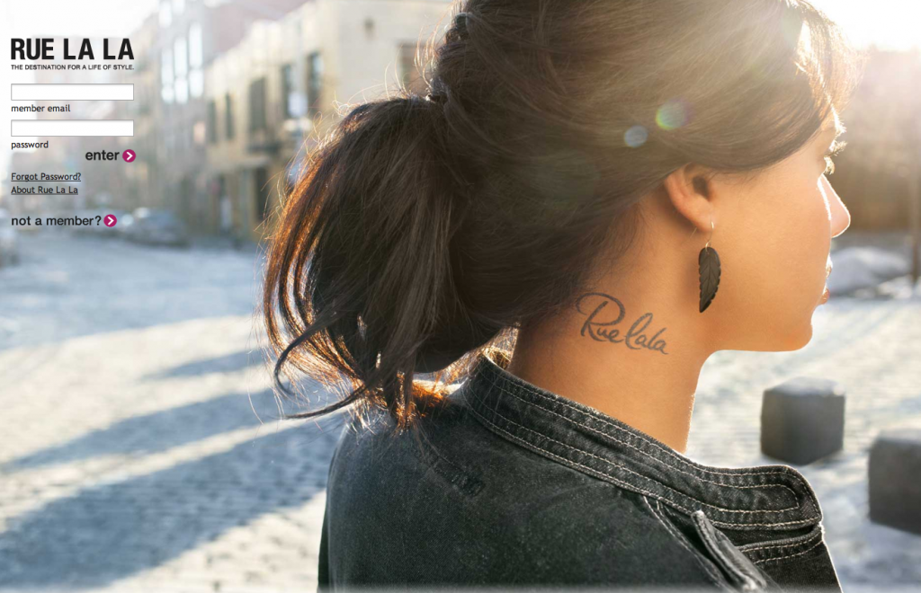
I just noticed that RueLaLa got a small makeover with a new logo and login splash screen. Once again, we’re lovin’ it!
 Very simple and chic! Love it!
Check it out on RueLaLa.com
I just noticed that RueLaLa got a small makeover with a new logo and login splash screen. Once again, we’re lovin’ it!
 Very simple and chic! Love it!
Check it out on RueLaLa.com
Comments are closed.
Hate it. The old logo was better. The two different “l”s look stupid and the tattoo on the neck image is tacky and cheap looking. Makes me wonder what the hell they were thinking…what were they trying to accomplish with a new logo? The old one was cute, chic and had personality.